Savings Optimizer
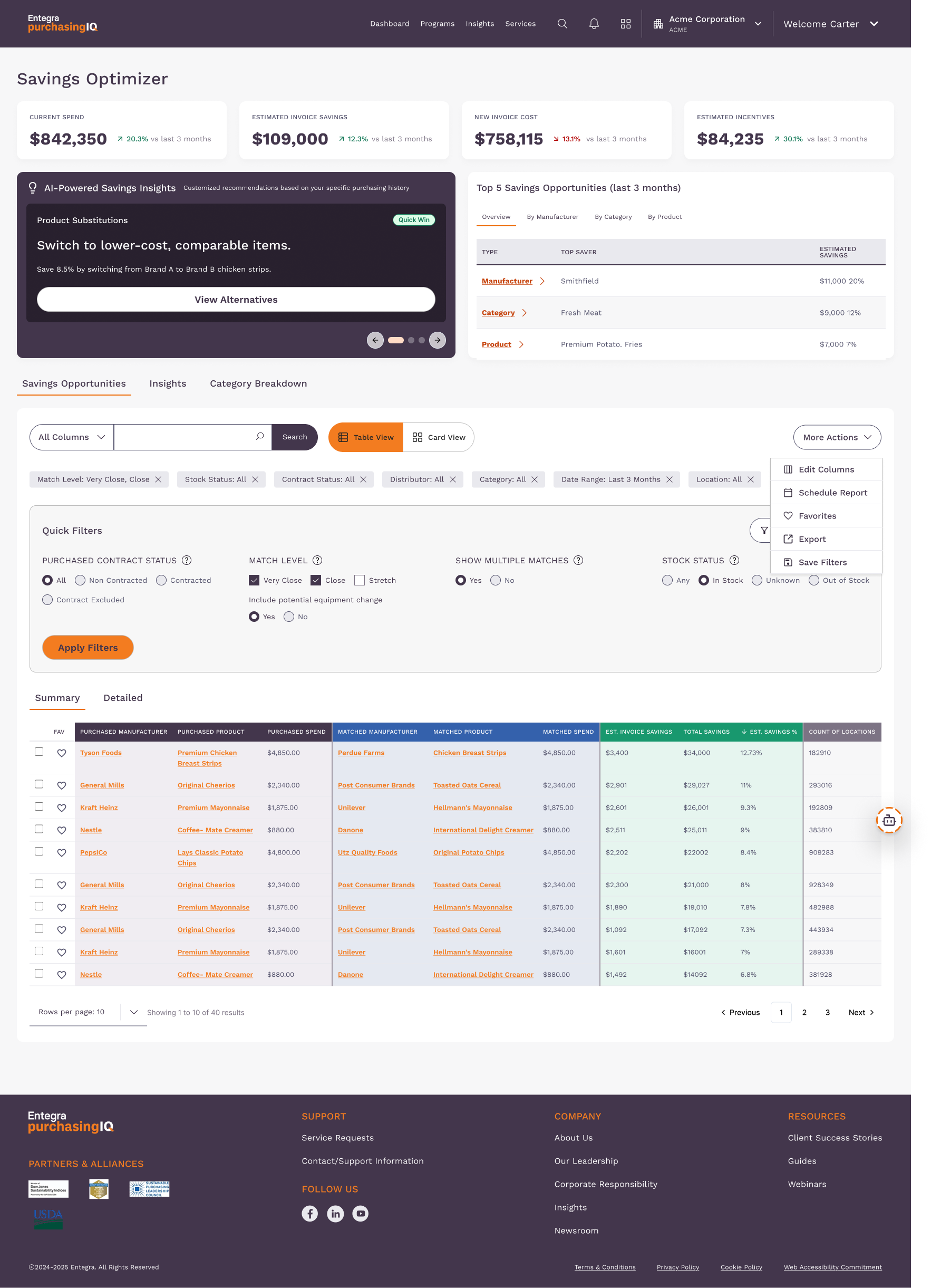
Improved how key metrics and definitions surface. New tooltip and definition-panel system lets users interpret savings data without leaving their flow.
Intro
I partnered with Entegra to refine their Savings Optimizer experience, focusing on how users interpret key metrics, definitions, and supporting guidance. Through research and iterative design, I created a more intuitive system of tooltips, definition panels, and structured content that helps users quickly understand their savings data and move more confidently through related workflows.
Duration: 5 Months
Role: Senior UX/UI Designer
The Problem
Users struggled to understand how key savings metrics were calculated, what terminology meant, and how to act on the insights presented in the Savings Optimizer. Existing definitions were dense and inconsistently placed, causing confusion, extra cognitive load, and slower decision-making across workflows.
The Goal
Create a clearer, more intuitive experience by improving how definitions, guidance, and supporting context are delivered throughout the product, enabling users to quickly interpret metrics, build confidence in their decisions, and navigate related workflows with ease.
My Role
Led end-to-end UX/UI design for the Savings Optimizer enhancement, from discovery to final delivery.
Conducted user interviews, current-state audits, and synthesis to uncover usability gaps and clarify user needs.
Defined the information architecture for terminology, definitions, and contextual guidance across the product.
Created low-fidelity explorations, workflows, and high-fidelity UI designs aligned with the product’s design system.
Developed interactive prototypes to validate concepts and demonstrate interaction patterns.
Planned and conducted usability testing to evaluate comprehension, discoverability, and task success.
User Research
We conducted a series of user interviews, workflow observations, and a current-state audit to understand how agents and procurement users interpreted savings metrics and interacted with definitions across the product. The research revealed that users often struggled to understand terminology, scoring logic, and next steps, leading to slower decision-making and inconsistent interpretations of key data. These findings shaped the redesign of the help system, definition panels, and contextual guidance throughout the Savings Optimizer.
12
Participants
Conducted interviews with 12 agents, managers, and procurement users to understand how they interpreted metrics, definitions, and guidance within the Savings Optimizer.
5
Usability Sessions
Completed moderated usability tests evaluating the clarity, discoverability, and effectiveness of tooltips, definition panels, and contextual guidance.
3
User Roles
Insights were gathered across three core user groups, agents, managers, and small business users, to ensure the redesigned experience addressed diverse needs and workflows.
Key Pain Points & Solutions
Unclear Metric Definitions
Users struggled to understand how key savings metrics were calculated or what the terminology meant, leading to low confidence in interpreting data.
Inconsistent Help Elements
Help icons, tooltips, and definitions appeared in different formats and locations throughout the interface, making them hard to discover and rely on.
Overly Dense Explanations
Existing definitions contained long blocks of text, increasing cognitive load and causing users to skim or skip important information.
Difficulty Connecting Definitions to Actions
Users couldn’t easily translate definitions into practical steps, leaving them unsure about what to do to improve their scores or performance.
Navigation Disruption
Opening side panels or definition content pulled users out of their workflows, causing them to lose their place and slowing task completion.
Limited Examples & Context
Users wanted real examples, visual cues, or contextual explanations to better understand how metrics applied to their real data.
Terminology Confusion Across Pages
Terms used in multiple sections sometimes differed slightly in wording or placement, creating inconsistencies that made interpretation harder.
Low Discoverability of Deeper Insights
Users didn’t always notice links or references that connected definitions to related workflows, resulting in missed learning opportunities.
User Personas

Sarah Chen
Director of Operations
A senior leader overseeing day-to-day operations across one or multiple properties typically within hospitality, senior living, or large-scale foodservice. They sit above department heads and are responsible for ensuring every location runs efficiently and profitably. They don't manage purchases line by line, but they own the P&L and are the ones answering to the executive team when costs spike. They rely on tools that give them a high-level view fast, with enough detail to act when something's off.

Michael Rodriguez
Procurement Specialist
Michael is a detail-oriented procurement specialist who manages supplier relationships and monitors savings performance. He relies on the Savings Optimizer to understand how vendors are performing, but complex terminology and unclear metric definitions often slow him down. Michael needs straightforward explanations, quick access to supporting information, and guidance that helps him take the right actions with confidence.
Information Architecture
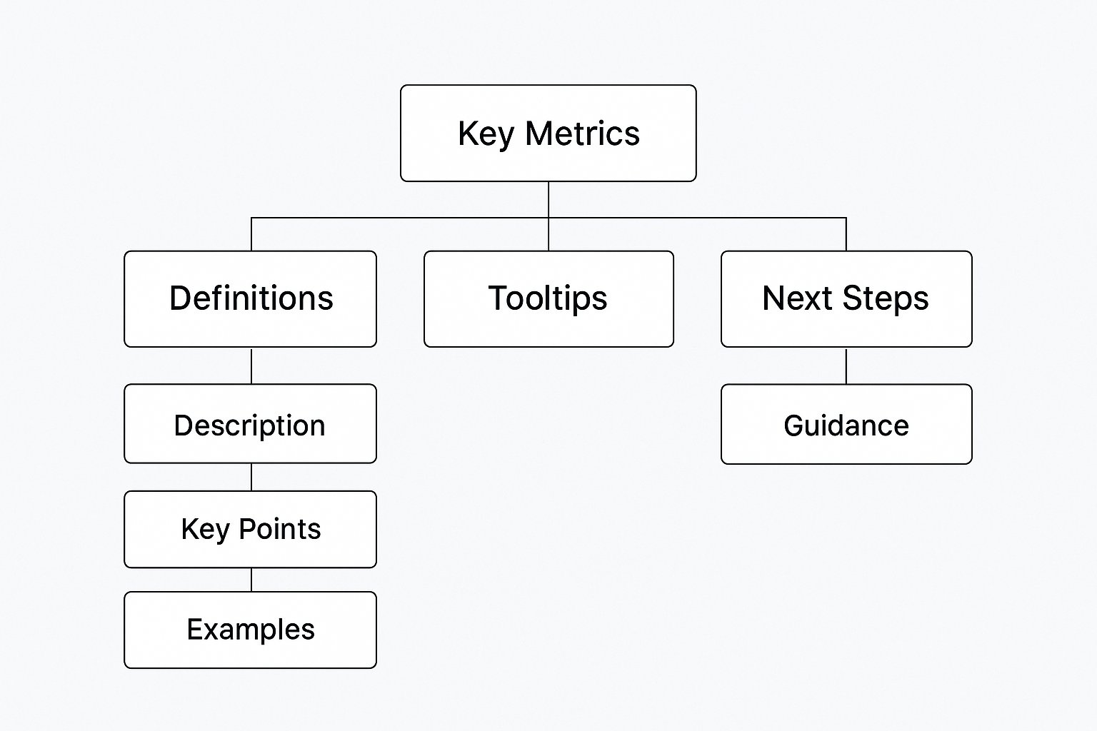
The Information Architecture for the Savings Optimizer was structured to make complex savings metrics easier to understand and navigate. Definitions, tooltips, and next-step guidance were organized into a clear, repeatable framework that supports user comprehension without disrupting workflow. Each layer of information is intentionally grouped to reveal only what users need at the moment they need it, reducing cognitive load, improving discoverability, and creating a more consistent product experience.
Key Metrics
High-level data points that users rely on to assess savings performance. These serve as the entry point into deeper layers of insight and are supported by definitions, tooltips, and contextual guidance.
Definitions
Structured explanations that break down complex terminology into clear, digestible content. Each definition provides context, key points, and examples to help users quickly understand how a metric works.
Tooltips
Quick-access clarifications that appear inline with key metrics and terminology. Tooltips provide concise explanations without disrupting the user’s workflow and guide users toward deeper, more detailed information when needed.
Next Steps
Action-oriented guidance that helps users understand what they can do with the information presented. These recommendations connect insights to workflows, supporting confident, informed decision-making.
Examples
Practical scenarios that demonstrate how definitions and metrics apply in real situations. Examples help users translate abstract concepts into relatable, real-world meaning.
Wireframes
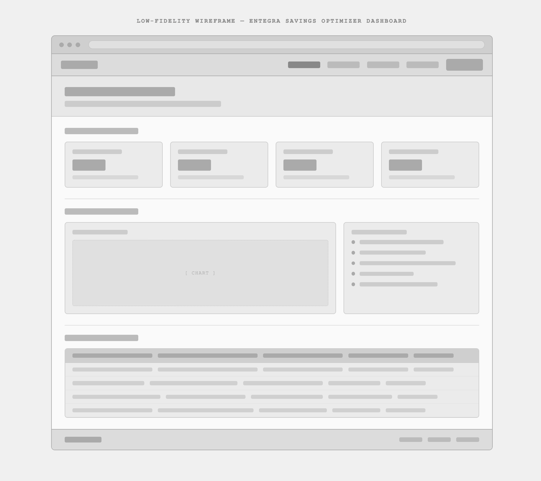
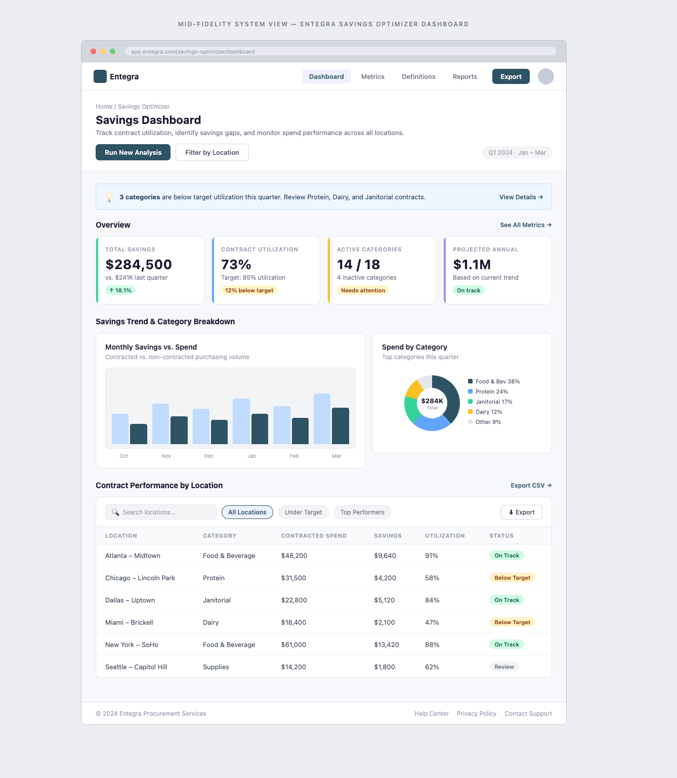
The mid-fidelity wireframe presents an organized dashboard designed to give users a quick overview of key savings metrics and insights. The top navigation Dashboard, Metrics, Definitions, and Reports makes it easy to switch between high-level monitoring and deeper analysis. Overview cards highlight top-level metrics at a glance, with placeholders for titles, values, and supporting details to help users spot patterns quickly. Further down, dedicated panels display definitions, guidance, and related metrics in a clean, card-based format. Consistent spacing and visual hierarchy keep content scannable without overwhelming the interface establishing a strong foundation focused on clarity, usability, and structured content organization."
Low-Fidelity Wireframes
Mid-Fidelity System Views
Usability Study
A moderated usability study was conducted to evaluate the clarity, discoverability, and effectiveness of the redesigned definitions, tooltips, and guidance patterns within the Savings Optimizer. Participants completed tasks centered on interpreting key metrics, locating supporting information, and identifying next steps. The study helped validate whether the new information architecture reduced cognitive load and enabled users to make more confident, informed decisions.
Study Type
Moderated Remote
Participants
6 Users (Agents, Managers, Procurement Specialists)
Session Length
30–45 Minutes
Methods
Task-Based Evaluation + Think-Aloud Protocol
Prototype Fidelity
High-Fidelity Interactive Prototype
Key Findings
- 1
Users struggled to locate definition content when help icons were inconsistently placed across the interface.
- 2
Long, text-heavy definitions increased cognitive load and led participants to skim or skip content.
- 3
Participants responded positively to structured definitions with clear hierarchy and examples, noting improved comprehension.
- 4
Tooltip interactions were highly effective when placed consistently near the associated metric.
- 5
Users wanted stronger visual cues and clearer pathways connecting definitions to related workflows or next steps.
- 6
Action-oriented guidance increased user confidence by helping them understand what to do after interpreting a metric.
High-Fidelity Mockups
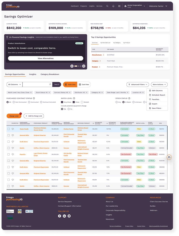
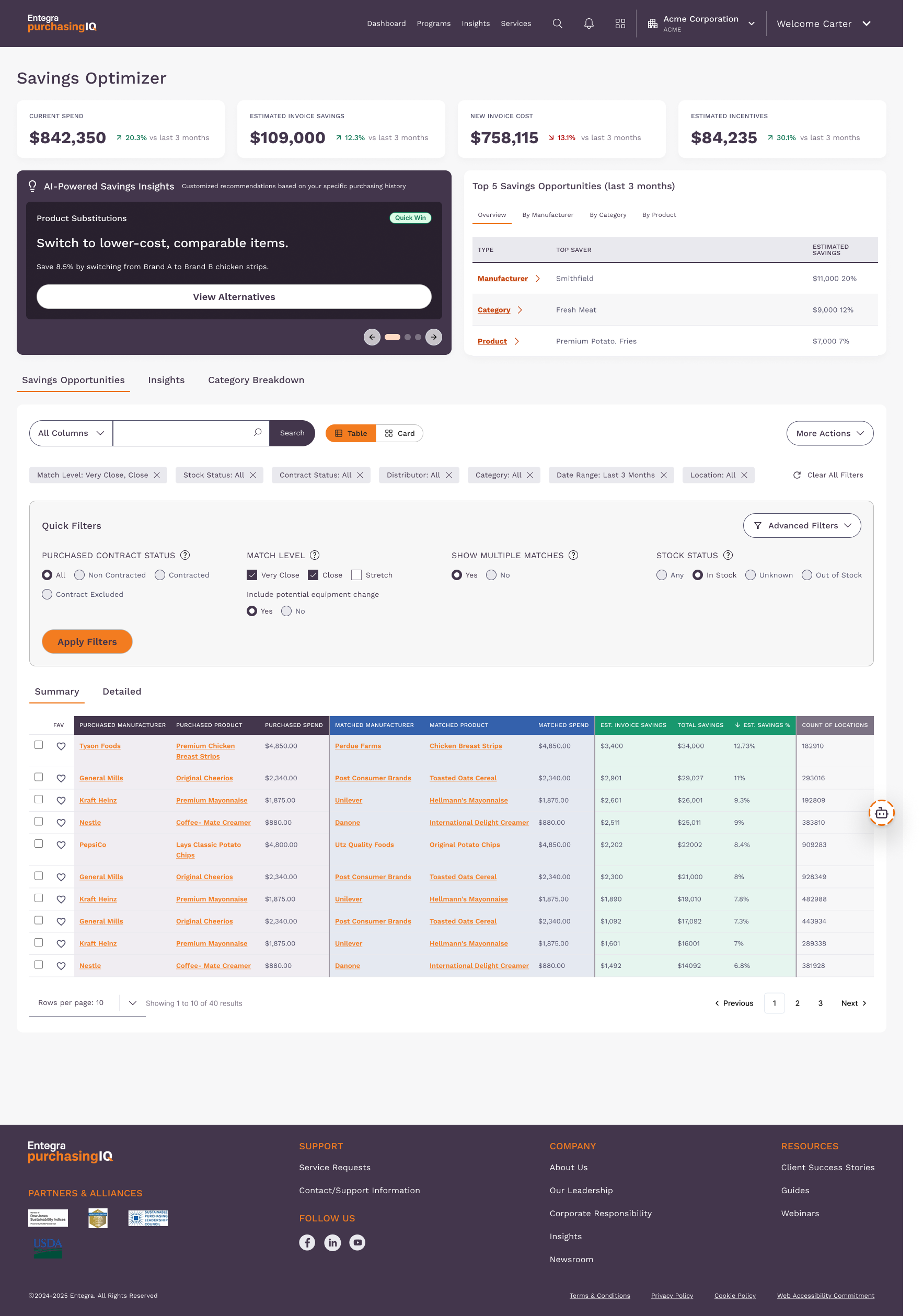
The high-fidelity wireframe brings the Savings Optimizer dashboard to life with refined visual design, purposeful hierarchy, and interactive elements that closely mimic the final product. Building on earlier wireframes, this version incorporates brand styling, typography, and component patterns aligned with the design system. Key metrics appear in visually distinct cards with contextual tooltips, while definition panels improve insight discoverability. Navigation is streamlined through a clean top bar, with definitions and next-step guidance keeping users oriented. This wireframe gives stakeholders a realistic view of the interface, enabling accurate feedback on layout, interactions, and usability.
Before User Testing
After User Testing
Accessibility Considerations
Accessibility considerations were integrated throughout the design process to ensure that all users, regardless of ability, could easily interpret savings metrics, access definitions, and navigate guidance. The interface follows WCAG 2.1 AA standards, with attention to keyboard navigation, screen-reader support, tooltip behavior, semantic structure, and color contrast. These practices help create an inclusive experience that improves clarity, reduces cognitive load, and supports users who rely on assistive technologies.
WCAG-Compliant Color Contrast
Keyboard-Accessible Tooltips
Clear Focus Indicators
ARIA Labels for Definitions & Icons
Logical Heading & Semantic Structure
Reduced Cognitive Load
Accessible Hover & Click States
Error Prevention & Guidance
Tested for Screen Reader Compatibility
Sufficient Interaction Target Sizes
Impact
10%
Increase in Completion Rates
7%
Increase in Active Usage
1.5 min
Time Saved per Task
+18
Pain Points Resolved
90%
Tooltip Discoverability
Key Takeaways
Clear, consistent definition patterns significantly improve user comprehension and reduce cognitive load in data-heavy interfaces.
Action-oriented guidance (“Next Steps”) plays a major role in helping users translate information into confident decisions.
Small interaction refinements, like standardized help icons and predictable tooltip behavior, have a large cumulative impact on usability.
Testing early and iterating on content hierarchy ensured that definitions became more scannable, accessible, and helpful across workflows.
A strong information architecture creates coherence across screens, resulting in smoother navigation and a more intuitive product experience.
Next Steps
Expand Glossary System
Develop a centralized, searchable glossary to house all metric definitions, examples, and related terms. This will help standardize terminology across the platform and ensure users can quickly locate consistent explanations regardless of where they are in the workflow.
Deepen Contextual Guidance
Enhance “Next Steps” sections by incorporating more scenario-based recommendations and linking them to actionable workflows. This will help users better understand how to respond to low metrics and what actions can improve their results.
Conduct Longitudinal User Testing
Run follow-up usability studies after launch to evaluate how the new definitions and tooltips perform over time. Tracking long-term comprehension and decision-making will provide valuable insights for future refinements.
Optimize for Mobile & Responsive Use
Refine designs to ensure clarity and accessibility across responsive breakpoints. This includes verifying tooltip behavior, layout scaling, and readability for users accessing insights on smaller devices.
Integrate Analytics for Definition Usage
Add tracking for tooltip opens, definition panel views, and glossary searches. These insights will reveal which terms cause the most confusion and help prioritize future content and design improvements.