InsureEase
End-to-end redesign of a life insurance application. Streamlined workflow, accessibility upgrades, fully responsive, applicants finish faster on every device.
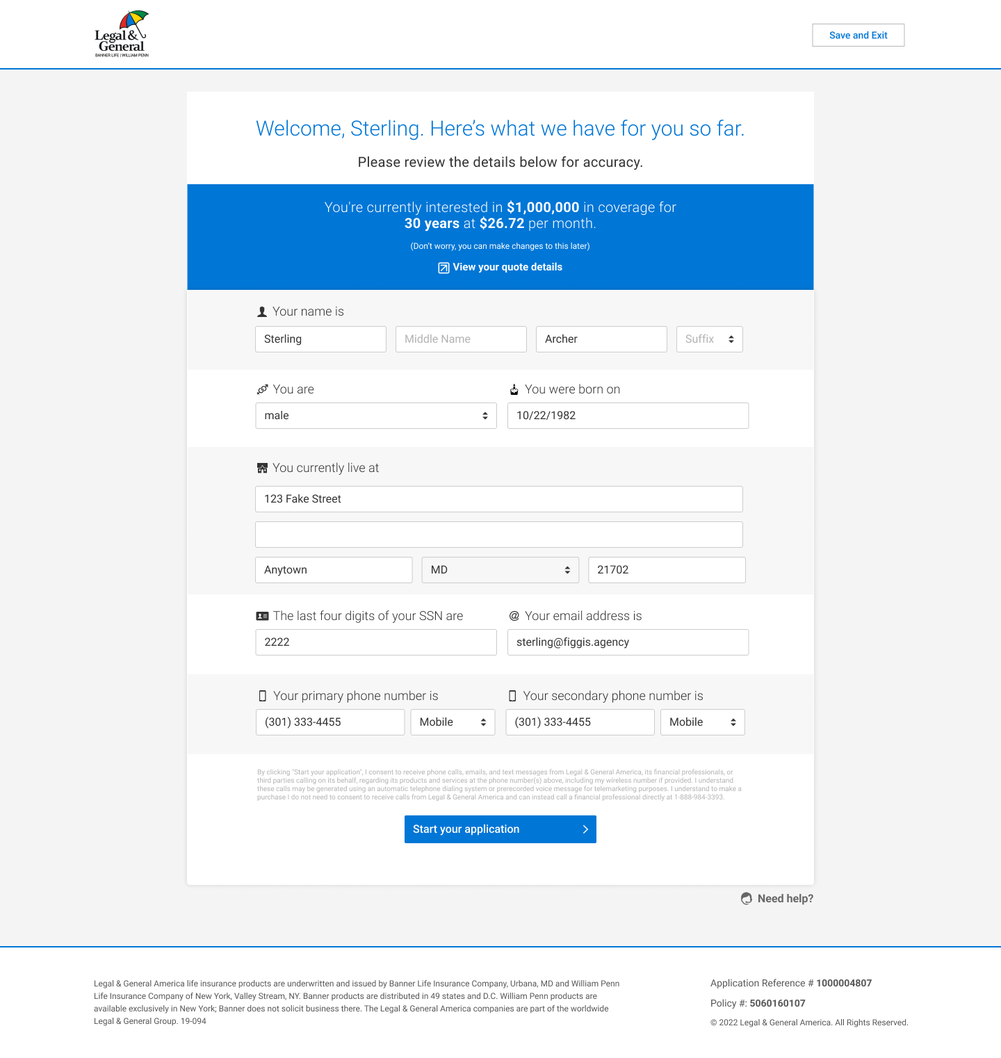
Intro
The Life Insurance Application project aims to simplify the user experience with a user-friendly interface, intuitive navigation, clear instructions, and minimal medical details. It covers login, terms and conditions, personal information, health history, and insurance details.
Duration: 1 Year
Role: Lead UX/UI Designer
The Problem
The current life insurance application process is lengthy, complex, and heavily focused on medical details, making it difficult for tech-savvy users to complete efficiently.
The Goal
To streamline the life insurance application process with a user-friendly interface, intuitive navigation, clear instructions, and minimal emphasis on medical details, ensuring a quick and efficient experience for applicants.
My Role
Conducted user research and gathered feedback
Created wireframes and prototypes
Developed a modern design system
Implemented design changes with Figma
Improved navigation and introduced shortcuts
Optimized the application process
Enhanced action buttons and visual aids
User Research
We conducted extensive user research, including interviews and observational studies with potential life insurance applicants. Initially, we assumed that the primary issue was the complexity of the application form. However, our research revealed that lengthy forms and the emphasis on medical details were significant pain points. These insights led to targeted design improvements, resulting in a more intuitive and efficient user experience.
Key Pain Points & Solutions
Navigation Inefficiencies
Users found the navigation cumbersome, leading to wasted time. This feedback guided us to implement a streamlined, user-friendly navigation structure in the application.
Complex Application Process
The process to complete the life insurance application was overly complex, requiring extensive details and multiple steps. We introduced shortcuts and simplified the form to make it more manageable.
Cluttered Interface
The application form was cluttered and difficult to navigate. We optimized space usage by organizing the form into clear sections and using a clean, modern design.
Lack of Clarity
Users had difficulty understanding key questions and instructions. We added tooltips, examples, and visual aids to better guide users through the application process.
User Personas

Diana Okafor
Life Insurance Applicant
Diana is a 44-year-old software engineer in Austin, TX who recently became a father for the first time. She's financially responsible, contributing to a 401k and carrying a mortgage, and knows she needs life insurance coverage but every application she's started has defeated him. She's deeply comfortable with technology but deeply uncomfortable with medical and insurance jargon. She wants to complete the application on her phone, in under 20 minutes, without needing to call anyone. The moment a form asks a confusing question with no context, she stops and comes back later - usually never.

Jordan Webb
InsureEase Life Insurance Agent
Jordan is a 34-year-old independent life insurance agent licensed in Texas, Georgia, and Florida. He writes term and whole life policies for individuals and small business owners, and uses InsureEase as he's primary application and client management platform. He handles 15–20 active applications at any given time and is constantly context-switching between guiding brand-new applicants and following up on stalled submissions. He's productive and organized, but the system creates friction: clients abandon forms, submit with missing health data, and Jordan has to manually bridge the gaps before underwriting review. He's deeply brand-loyal to carriers that make the submission experience smooth and openly vocal when it isn't.
Information Architecture
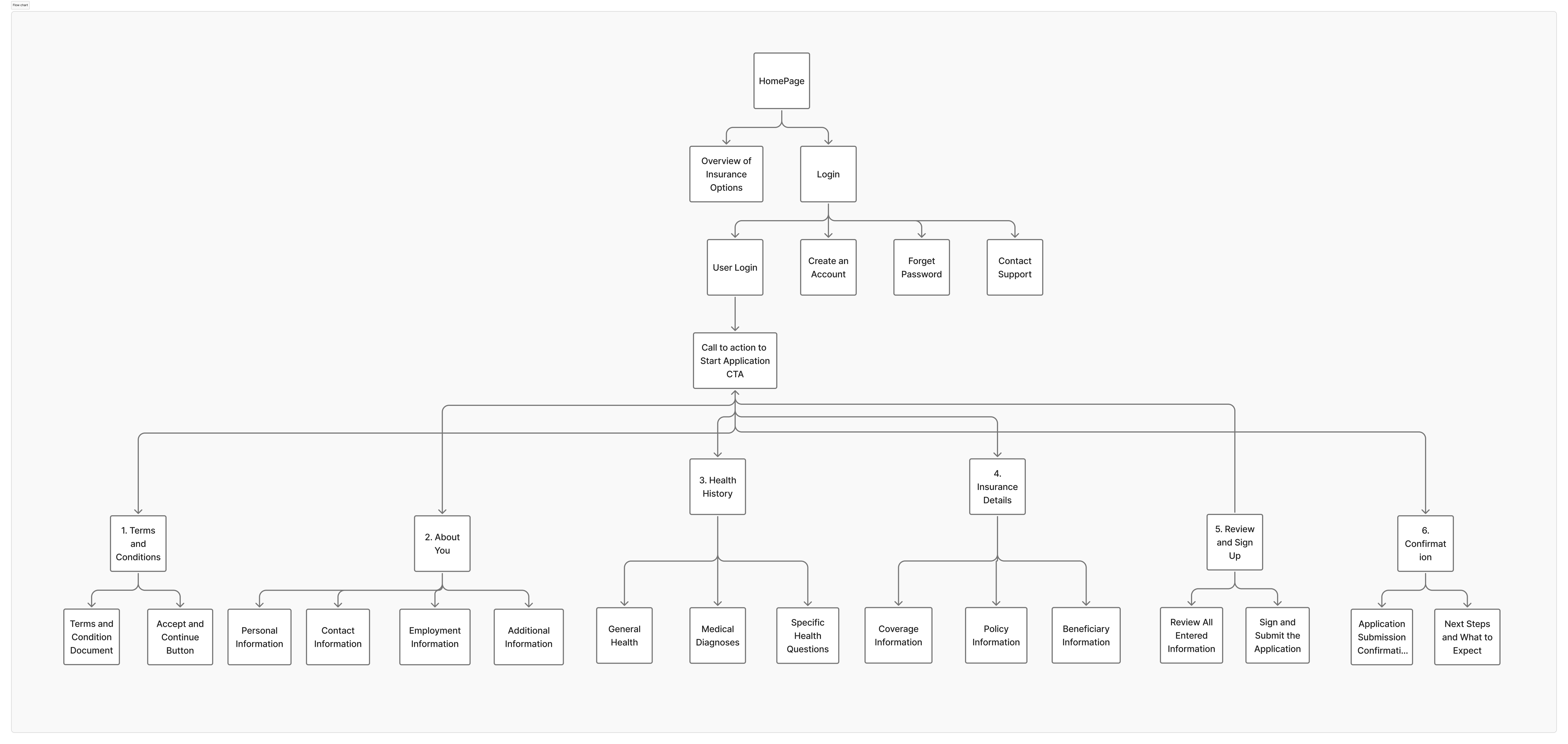
Navigating the application was a major pain point for users, so I created a sitemap to improve navigation. The structure simplifies and clarifies navigation, allowing users to quickly find key sections like personal information, health history, and insurance details. This enhances user experience and efficiency in completing the life insurance application.
Wireframes
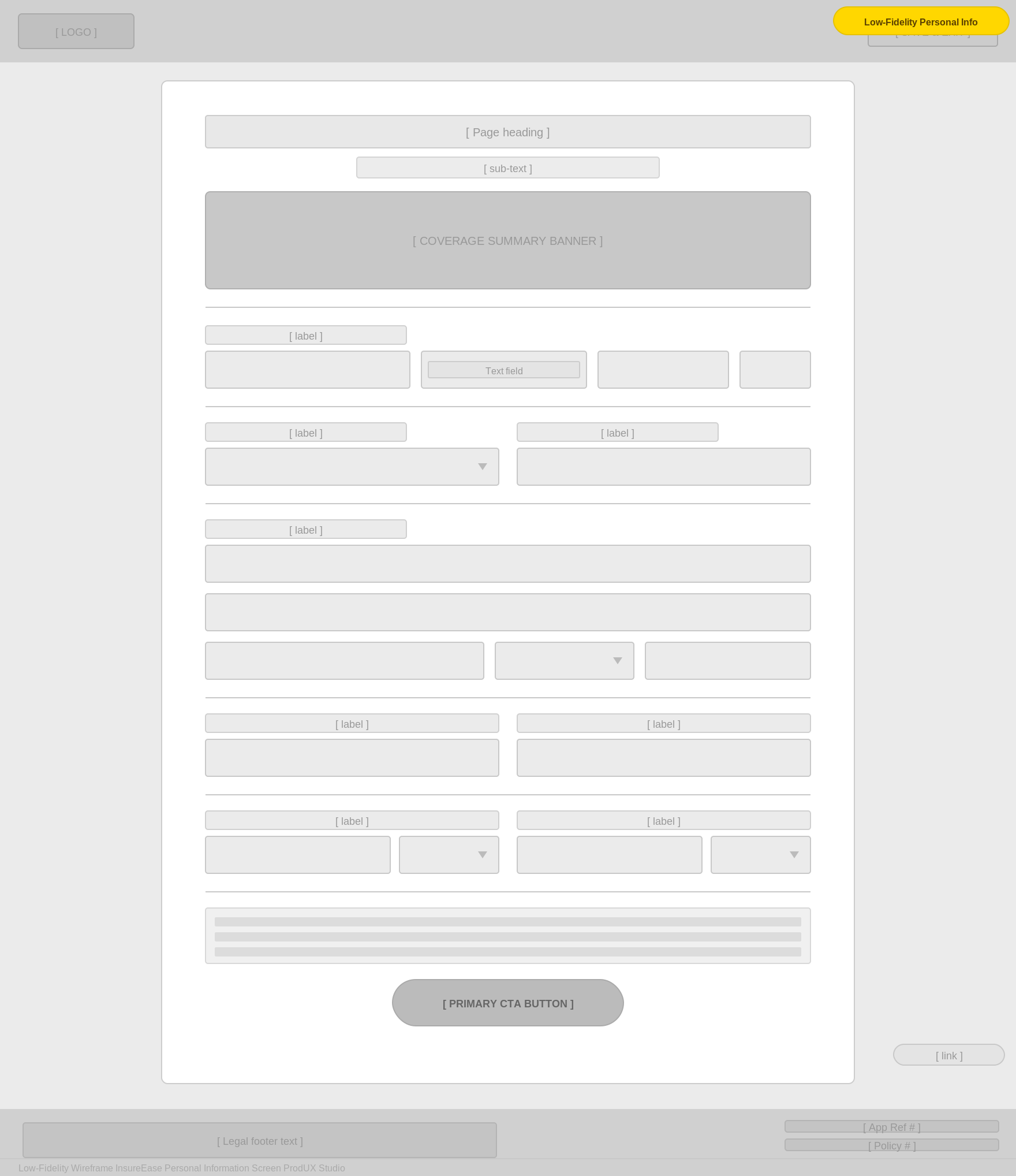
I developed low-fidelity prototypes for the life insurance application to map out the user flow and address usability issues early. Key sections included the welcome screen, personal information, health history, and insurance details. User feedback led to improvements in navigation, clearer instructions, and better accessibility, enhancing the overall user experience.
Low-Fidelity Wireframes
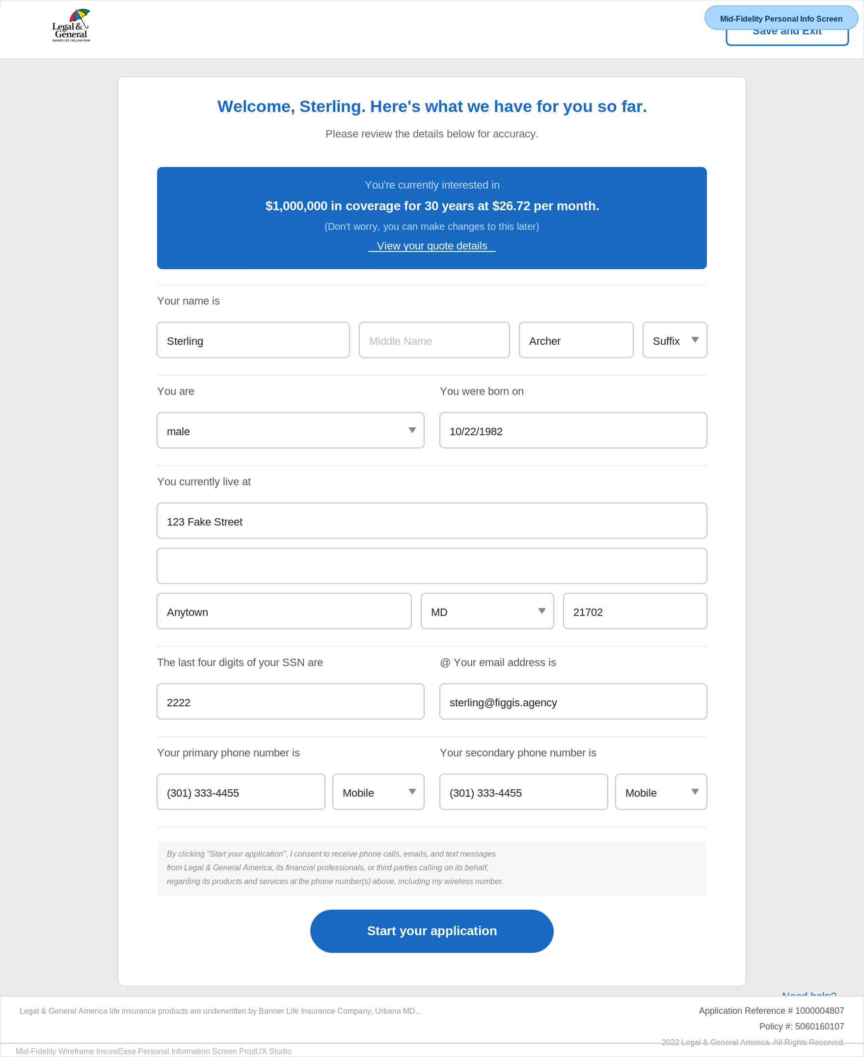
Mid-Fidelity System Views
Usability Study
Our usability study revealed several key areas for improvement that significantly enhanced the user experience.
Study type
Unmoderated usability study
Location
United States, remote
Participants
1 participant
Length
January – December 2019
Key Findings
- 1
Improved Navigation Participants appreciated the new streamlined navigation, which significantly improved their efficiency in completing the application.
- 2
Simplified Process The introduction of a simplified application process was well-received, as it reduced the complexity and time required to complete the form.
- 3
Clear Visual Aids Visual aids like tooltips, examples, and clear instructions made understanding and completing the application much easier for users.
High-Fidelity Mockups
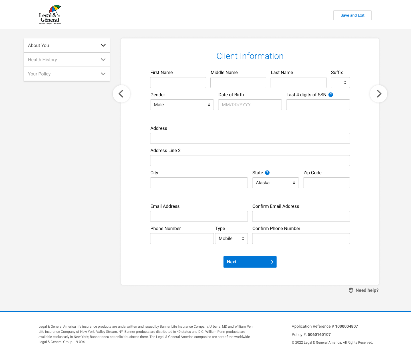
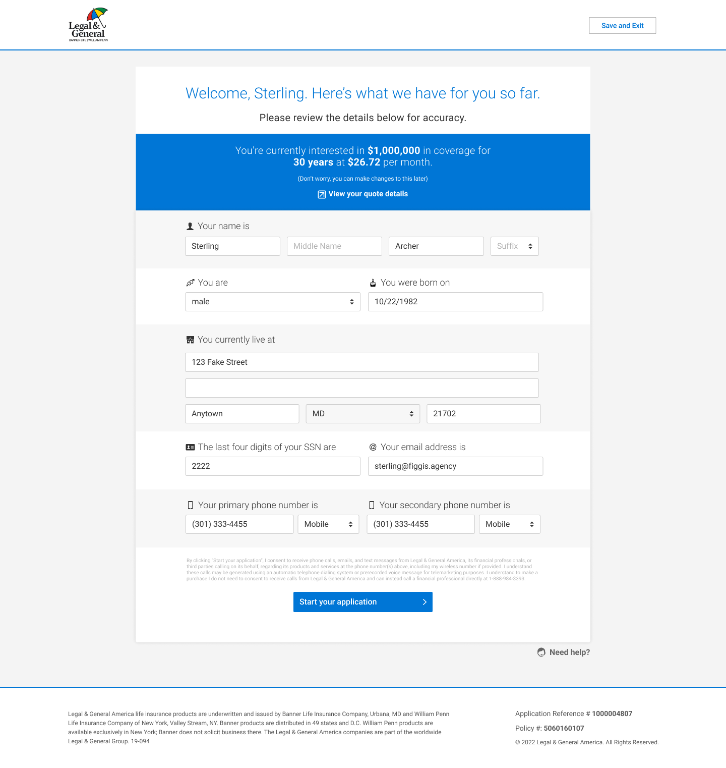
The high-fidelity mockups demonstrate how the redesigned life insurance application adapts seamlessly across various screen sizes. These mockups highlight the responsive layout, ensuring that users have a consistent and intuitive experience whether they are accessing the application on a tablet, desktop, or mobile device. Key screens including the welcome page and coverage information were optimized for clarity, readability, and ease of navigation, reflecting the final visual style, branding, and interaction patterns of the product.
Before User Testing
After User Testing
Accessibility Considerations
Accessibility was a core priority throughout the design of the life insurance application. The goal was to ensure that users of all abilities including those with visual, motor, or cognitive impairments could complete the application independently and without barriers. To achieve this, I applied industry-standard accessibility practices based on WCAG guidelines and inclusive design principles.
Keyboard Navigation
Screen Reader Compatibility
Color Contrast
Impact
45%
Faster Application Completion
60%
Decrease in User Errors
80%
Increase in User Satisfaction
50%
Reduction in Support Requests
Key Takeaways
Throughout this project, I learned the importance of user feedback in the design process. It taught me to challenge my assumptions and focus on practical improvements that directly address user pain points.
Next Steps
Conduct Additional User Testing
Gather feedback on the new application features and identify any remaining usability issues. This will help refine the design and ensure it meets user needs effectively.
Expand Functionality
Introduce new tools and features, such as interactive elements and visual aids, to provide users with a more comprehensive and user-friendly application process.
Implement Training Sessions
Offer ongoing training sessions to help users familiarize themselves with the new features and shortcuts, ensuring they can take full advantage of the redesigned application and maximize their efficiency.